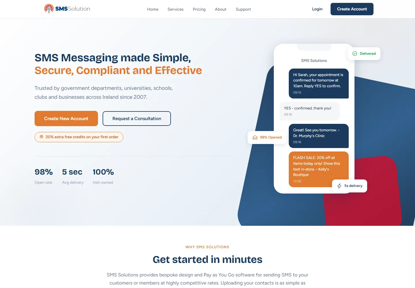
The product, explained fast.
A capable product that needed a clearer pitch
Software products carry a lot of detail: features, use cases, pricing and integrations. The risk is that a visitor lands on the page, cannot quickly grasp what the product does or who it is for, and leaves before reaching the part that matters to them.
SMS Solutions needed a website that could explain a business messaging platform in plain language, build confidence quickly and then send each visitor towards the right next step, without forcing everyone down a single funnel.
A journey that guides two kinds of visitor
We designed the site around the two people who arrive: the one ready to sign up and get going, and the one who wants to ask a question first. The layout gives both a clear, unhurried route.
- A focused opening that says what the platform does and who it helps, before any detail arrives.
- Feature and benefit sections structured so visitors can scan for the point relevant to them rather than reading everything.
- Two clear calls to action running through the page, one towards account creation and one towards a consultation.
- A confident, modern visual style that suits a software brand and reads well on any device.
- A conversion-led structure that keeps the next step visible without crowding the content.
A clearer route from landing to action
The finished website explains the SMS Solutions product faster and gives every visitor an obvious next move, whether they are ready to create an account or would rather speak to someone first. The message stays clear and the path forward is never in doubt.
It is the kind of conversion-focused thinking we bring to every web design project, structure and clarity working together so a visitor always knows what to do next.