Banking made easy to reach.
A credit union serving its Kildare community
Life Credit Union is a member-owned credit union serving communities across County Kildare, with branches on North Main Street and at Monread Shopping Centre in Naas, on Edward Street in Newbridge and on Main Street in Maynooth. It describes itself as working in the heart of its local community and continues to offer face-to-face service in every branch, summing up its own position as digital when you want us, human when you need us.
Its range is broad for an organisation of that kind: personal loans including car, home improvement, student and green loans, savings accounts including children's savings, mortgages, current accounts with a Visa debit card and mobile payments, insurance, foreign currency, and online and mobile banking.
Brandstart designed and built the website behind that. This page is our own account of the project: what the client needed, the decisions we made and what we handed over.
A lot of services, one homepage
A credit union does a great deal for its members: personal loans, savings, mortgages, current accounts, online banking and community support. The difficulty is presenting all of that without overwhelming the person who has arrived to do one specific thing, whether that is applying for a loan, checking a balance or joining as a new member.
There is a second tension underneath it. A credit union is not a bank and does not want to feel like one, but it is still a regulated financial institution and the site has to carry that seriousness. Warmth without credibility reads as amateur; credibility without warmth loses the very thing that makes a member-owned organisation different from the pillar banks. The design had to hold both at once.
Geography added a third. A member walking into the Maynooth branch and a member using online banking from Newbridge at ten at night both arrive at the same homepage, and the site cannot assume which one is reading. It has to serve the person who wants a branch, an opening hour and a face, and the person who never intends to visit one.
Life Credit Union needed a website that felt approachable and human, matched the trust people expect from their local credit union, and still made every service quick to find.
Structuring around the reason for the visit
We started from the member rather than from the service list. Most visits to a credit union website are errands, not browsing: apply for a loan, work out a repayment, check a balance, find out how to join, find a branch. If the site is organised the way the organisation is organised, every one of those errands turns into a hunt through menus. If it is organised the way members think, most of them finish in a click or two.
So we mapped the common tasks first and let the structure follow. The everyday actions were pulled to the surface of the homepage and given permanent shortcuts. The wider product range was grouped into a small number of top-level categories that a member can self-select from without knowing internal terminology. Everything else was allowed to sit further down, where depth belongs.
The build was treated as mobile-first throughout, because a growing share of members now manage their money on a phone, and accessibility was handled as a requirement rather than a finishing pass. A member-owned financial institution is held to a higher standard on that than most businesses, and it is far cheaper to build in than to retrofit.
A journey organised around the member
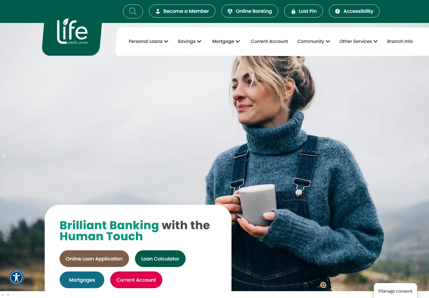
We designed the site around the reasons members actually visit, then built the layout to match. The homepage leads with a warm, reassuring message and puts the most common actions within immediate reach, so nobody has to hunt through menus to get started.
Branch information was treated as a first-class part of the site rather than a line in the footer, so a member looking for Naas, Newbridge or Maynooth finds the address and the detail they need without digging. The same information is what a local search will surface, so keeping it accurate and easy to reach serves both audiences at once.
What we handed over
- Prominent shortcuts to the everyday tasks, including online loan applications, the loan calculator, mortgages and current accounts.
- Clear top-level navigation grouping personal loans, savings, mortgages and other services so members can self-select fast.
- Direct access to member essentials such as online banking, becoming a member and support, always visible at the top of the page.
- Branch pages and contact detail covering the Naas, Newbridge and Maynooth locations, kept easy to find from anywhere on the site.
- A clean, mobile-first layout that reads well on a phone, where a growing share of members now manage their money.
- Considered accessibility, in keeping with the standards a member-owned financial institution is held to.
- A content structure the credit union can extend as products and rates change, without a redesign each time.
A clearer path from arrival to action
The result is a website that gives members a direct route from the homepage to the products they need, with the everyday banking tasks surfaced first rather than buried. The look stays true to the Life Credit Union brand: friendly, trustworthy and unmistakably local.
It also gives the credit union something durable to build on. Branch detail, product pages and joining information all sit in one properly structured place, which is what every other route into the organisation eventually points at, from a Google listing to a poster in a branch window.
It is the kind of considered, service-led design we bring to every web design project, structure and clarity working together so a visitor always knows what to do next. It is also the standard we bring to web design work across Kildare, in Naas, Newbridge, Maynooth and the towns around them.